Your cart
There are no more items in your cart
In an age dominated by digital, choosing the font for your website may seem like a minor detail. However, this decision can have a significant impact on the success of your site. A font can affect not only the aesthetic appearance of your site, but also your bounce rate and conversion rates. A font that is difficult to read can turn visitors away, while a well-chosen font can improve the user experience and increase time spent on the site. This article explores the importance of fonts, the use of Web Fonts, Web accessibility, Google Fonts, and available alternatives.
Choosing a font for your Web site may seem like a minor detail, but it can actually have a significant impact on the success of your site. A font can affect not only the aesthetic appearance of your site, but also your bounce rate and conversion rates. A font that is difficult to read can turn visitors away, while a well-chosen font can improve the user experience and increase time spent on the site. That's why it's important to take the time to choose the perfect font for your website.
Steve Jobs was the first to realize the importance of fonts
Steve Jobs, co-founder of Apple, had an educational experience during his days at Reed College that had a significant impact on the future of computer design. After officially leaving college, Jobs continued to take classes that interested him, including a course in calligraphy.
During his Commencement address at Stanford University in 2005, Jobs talked about how calligraphy fascinated him. He studied serif and sans serif typography, line spacing, and spacing between letters. At the time, he did not see a practical application for what he was learning, but he found the subject fascinating.
However, about ten years later, when he was designing the first Macintosh, it all came in handy. Jobs insisted on the importance of including a variety of beautifully designed fonts in the Mac's operating system. This was a big step forward from the monospace fonts that were common in computers at the time. The inclusion of these fonts made the Mac particularly popular in advertising and graphic design.
In addition, Jobs' attention to typographic detail led to the creation of word processing programs that allowed users to select different font styles and sizes, a concept we now take for granted.
In sum, Jobs' experience with handwriting had a lasting impact on computer design and helped establish the importance of graphic design in computing.
What are Web Fonts
Web Fonts are fonts that are used on Web sites and are downloaded from the server to the user's browser when visiting a Web site. These fonts allow designers to use a much wider range of fonts than the traditional "web-safe fonts," which are limited to the fonts installed on most computers.
Web Fonts can be of various formats, including TrueType (TTF), OpenType (OTF), Web Open Font Format (WOFF), and Embedded OpenType (EOT). Each format has its advantages and disadvantages, and not all browsers support all formats.
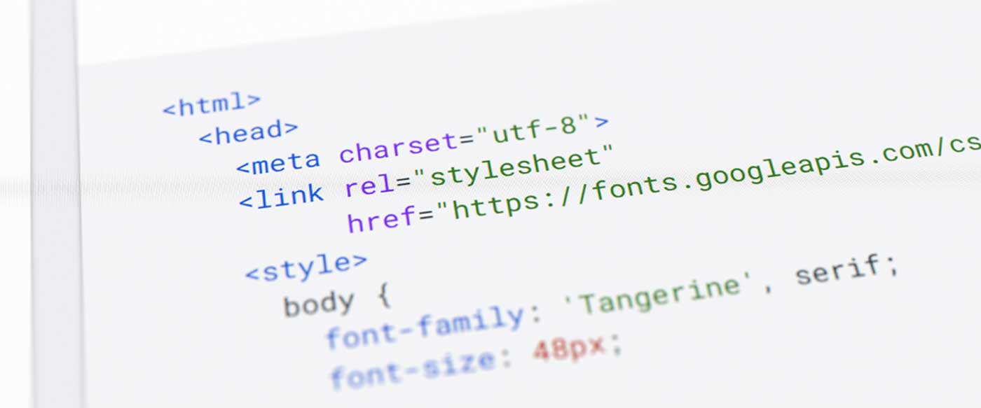
Google Fonts is a popular example of a Web Fonts service. It offers a wide range of open source fonts that can be used for free on Web sites. When using a service such as Google Fonts, the font is downloaded from Google's server to the user's browser when the website is visited.
What advantages do Web fonts offer?
The use of Web Fonts offers a number of significant benefits for designers and Web site developers. Here are some of the main benefits:
Wide choice of fonts: Web Fonts offer a wide range of style options, allowing designers to choose from thousands of different fonts. This wide choice can help you create a unique and distinctive design for your website.
Design Consistency: By using Web Fonts, you can ensure that your website appears consistent across all devices and browsers. Unlike system fonts, which can vary from device to device, Web Fonts are downloaded from your website, so they will appear the same for all users.
Improving accessibility: Some Web Fonts are designed specifically for readability, which can improve the accessibility of your Web site. You can choose fonts that are easy to read for people with visual impairments or dyslexia.
Brand customization: Web Fonts can help establish your brand identity online. You can choose a font that aligns with your brand and use it throughout your Web site to create a consistent online presence.
Support for international fonts: Many Web Fonts support a wide range of font sets, including those for non-Latin languages. This can be especially useful if your website is intended for an international audience.
Improved user experience: Good use of Web Fonts can improve the user experience, making your site more pleasant to read and navigate. A well-chosen font can improve the readability and visual appeal of your site.
Ease of use: Many Web Fonts services, such as Google Fonts, are easy to use and integrate into your website. This makes it easier for designers and developers to implement custom fonts in their projects.
Remember, however, that the use of Web Fonts must be balanced with performance and accessibility considerations. Using too many Web Fonts or heavy fonts can slow down the loading time of your site, which can have a negative impact on the user experience.
The disadvantages of Web fonts?
Despite the many advantages of using Web Fonts, there are also some disadvantages to consider. Here are some of the main ones:
Longer loading times: Using Web Fonts can increase the loading time of your Web site. Each font you add to your site must be downloaded by the user's browser, which can slow down the time it takes to load your site, especially if you are using heavy fonts or a large number of different fonts.
Browser compatibility: Not all browsers support all Web Fonts formats. Although most modern browsers support a wide range of Web Fonts formats, there may be compatibility problems with older browsers.
Display problems: If a Web Font is not loaded properly, for whatever reason, it may cause display problems on your site. For example, the browser may show a spare system font until the Web Font is fully loaded, causing an effect known as "flash of unstyled text" (FOUT).
Licenses and copyrights: Although many Web Fonts are free and open source, some require a license for commercial use. It is important to make sure you have the necessary rights to use a particular font on your Web site.
Lack of quality control: Not all Web Fonts are of high quality. Some may not be optimized for on-screen display, or they may not offer a wide range of weights and styles.
Accessibility: Not all Web Fonts are easy to read, which can create accessibility problems. It is important to choose fonts that are clear and readable for all users.
Lack of support for special characters: Some Web Fonts may not support special characters or non-Latin alphabets, which can be a problem if your Web site is intended for an international audience.
Remember, the main goal should always be to provide the best possible experience for your Web site users. If your use of Web Fonts compromises that experience in any way, you may need to reconsider their usefulness.
How to choose the right Web Font?
Font choice is a very important aspect of web accessibility. A poorly chosen font can make it difficult for users to read and understand the content of your website, especially for those with visual impairments or dyslexia. Here are some key points to consider:
Readability: Some fonts are easier to read than others, especially on screen. Fonts with a consistent stroke width are generally more readable. Avoid fonts with excessive decorative features for the body of the text.
Font size: Font size can have a big impact on readability. A font that is too small can be difficult to read, especially for users with visual impairments. WCAG guidelines suggest a minimum text body size of 16px.
Contrast: The contrast between the font color and the background color can greatly affect readability. Too little contrast can make text difficult to read. The WCAG guidelines provide specific recommendations on contrast ratio.
Familiar fonts: Using familiar fonts can improve readability because users do not have to get used to a new set of letterforms.
Adaptability: The font should be able to adapt to user preferences, such as increasing the font size or changing the font or background color.
Remember, the goal of web accessibility is to ensure that everyone can use your website, regardless of their ability or disability. Choosing the right font can make a big difference in making your website accessible to everyone.
Although a font may look aesthetically pleasing, if visitors struggle to read it, they are likely to abandon your site.
What is meant by web accessibility?
Web accessibility refers to the practice of making Web sites usable by as many people as possible, including those with visual, hearing, motor, or cognitive disabilities. The goal is to ensure that everyone can access, use and understand web content.
The World Wide Web Consortium (W3C) has developed a set of guidelines called the Web Content Accessibility Guidelines (WCAG) to help Web site creators make their content accessible.
What are Google Fonts
Google Fonts, formerly known as Google Web Fonts, is a library of more than 1,000 royalty-free fonts that can be used on websites or downloaded to your computer. These fonts are open source, which means they can be used, modified and shared freely.
Google Fonts was introduced by Google in 2010 with the goal of making the web more beautiful, accessible and open. Since then, it has become a popular tool among website designers and developers because of its wide selection of high-quality fonts and its ease of use.
To use Google Fonts on a website, simply select the desired font from the library, copy a code snippet provided by Google, and paste it into your HTML code. The font will then be downloaded from Google's server each time someone visits your website. This process allows designers to use custom fonts without having to host them on their own web server, which can save bandwidth and improve site load times.
Why use Google Fonts
Google Fonts is an invaluable resource for website designers. It offers over a thousand font families, all of which are free and open source, meaning they can be used without restriction in commercial projects. In addition, Google Fonts are maintained and provided by Google, thus ensuring their security. The quality of fonts available on Google Fonts is of a high standard, making this platform a reliable choice even for less experienced designers.
Google Fonts is an invaluable resource for website designers. It offers over a thousand font families, all of which are free and open source, meaning they can be used without restriction in commercial projects. In addition, Google Fonts are maintained and provided by Google, thus ensuring their security. The quality of fonts available on Google Fonts is of a high standard, making this platform a reliable choice even for less experienced designers.
Google Fonts: a treasure trove of options
With 1052 font families available for free, Google Fonts is an invaluable resource for website designers. Choosing the right font can have a significant impact on your site's bounce rate and conversion rates.
What to look for in a Google font
When choosing a font from Google Fonts, there are several factors to consider. The font should fit your brand, be legible, and fall into one of five main classifications: serif, sans-serif, script, monospace, and decorative. In addition, you should consider whether the font will be used as a display or body font.
The most commonly used fonts for their readability are as follows:
Roboto: Designed by Christian Robertson for Google, Roboto is a sans-serif font with geometric shapes. It is the default font for Android and Chrome OS, and is known for its on-screen readability.
Open Sans: Created by Steve Matteson, Open Sans is a sans-serif font designed to be friendly and open. It is very readable, making it suitable for use in both body text and headlines.
Side: Side is a sans-serif font designed by Łukasz Dziedzic. It has a professional look that makes it suitable for use in a variety of contexts.
Montserrat: Inspired by the signs and posters of the Montserrat neighborhood of Buenos Aires, this sans-serif font designed by Julieta Ulanovsky has a modern, geometric look.
Oswald: Designed by Vernon Adams, Oswald is a sans-serif font reworked specifically for screen use. It has a modern look that makes it suitable for use in headlines.
Source Sans Pro: This is Adobe's first open source font, designed by Paul D. Hunt. It is a sans-serif font inspired by the graceless fonts of the 20th century.
Slabo: Slabo is a collection of serif fonts designed specifically for use at a given pixel size. For example, Slabo 27px is optimized for use at 27 pixels.
Noto Sans: Part of Google's Noto project, Noto Sans is designed to cover all written languages in the world. It is a sans-serif font with a clear and readable design.
Nunito Sans: Nunito Sans is a sans-serif font with a slightly rounded appearance. It is the sans serif version of the Nunito font.
Prompt: Prompt is a sans-serif font designed by Cadson Demak. It has a friendly and readable appearance that makes it suitable for use in both headlines and body text.
Raleway: Raleway is an elegant and sophisticated sans-serif font, originally designed by Matt McInerney as a single weight and later expanded into nine weights.
PT Sans: PT Sans is part of the PT font family, released as part of the "Public Types of Russian Federation" project. It is a sans-serif font with a modern appearance.
The readability of monospace fonts
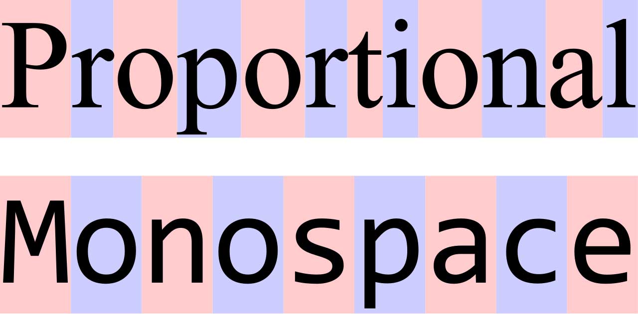
Monospace fonts are characterized by the fact that each character occupies the same space, left and right, creating a highly readable area. This makes them ideal for programming, where strings, numbers, operators and punctuation are worked on.
Legacy of Monospace fonts: These fonts are derived from typewriter fonts, used in typewriters, and were later adopted in early command terminals. Since then, the use of Monospace fonts has remained a constant in the programming world.
The 10 most popular Monospace fonts: Roboto Mono, Andale Mono, Incosolata, Fira Mono, Source Code PRO, Anonymous PRO, Droid Sans Mono, Oxygen Mono, PT Mono, and Hack. Each of these fonts has its own unique characteristics and history.
In summary, Monospace fonts play a vital role in the programming world by providing readability and uniformity. Despite the evolution of technology and the advent of new devices, the use of Monospace fonts has remained a constant, testifying to their importance and hidden beauty.
What alternatives are there to Google Fonts?
There are several alternatives to Google Fonts that offer a wide range of fonts for website designers and developers. Here are some of the most popular:
Adobe Fonts (formerly Typekit): Adobe Fonts offers an extensive library of high-quality fonts. It is included in many of Adobe's Creative Cloud subscriptions, making it a good choice for those already using Adobe's tools.
Font Squirrel: Font Squirrel offers a large selection of free fonts for commercial use. It also offers an @font-face generator that allows you to convert fonts to web-friendly formats.
Fonts.com: Fonts.com offers over 150,000 fonts from hundreds of foundries. Some fonts are free, while others require a subscription or single purchase.
MyFonts: MyFonts offers a wide range of fonts from numerous foundries. It offers both free and paid fonts, and many of the paid fonts offer a free trial version.
Fontspring: Fontspring sells DRM-free fonts from several foundries. It offers both free and paid fonts, and prices are determined by the foundry.
DaFont: DaFont offers a wide selection of free fonts, many of which can be used for personal use. For commercial use, you may need to contact the font author.
Creative Market: Creative Market offers a wide range of creative resources, including fonts. Many of the fonts are paid, but the site also offers free resources each week.
FontShop: FontShop sells fonts from a variety of foundries. It offers both free and paid fonts, and prices are determined by the foundry.
Remember, when choosing a font from a service other than Google Fonts, it is important to check the licensing terms to make sure you have the necessary rights to use the font in your project.
Conclusion
Choosing the right font is a crucial aspect of your website design. Not only can it affect the aesthetic appearance of your site, but it can also have a significant impact on readability, accessibility, and user experience. Whether you choose to use Google Fonts or another resource, it is important to take the time to choose a font that aligns with your brand and is easy for all users to read.
Remember, the main goal should always be to provide the best possible experience for your website users.
Some useful references and sources to further explore the topic covered in the article:
Google Fonts: a library of over 1,000 royalty-free fonts that can be used on websites or downloaded to your computer.
Web Content Accessibility Guidelines (WCAG): a set of guidelines developed by the World Wide Web Consortium (W3C) to help Web site creators make their content accessible.
Adobe Fonts: offers an extensive library of high-quality fonts. It is included in many of Adobe's Creative Cloud subscriptions.
Author: Loris Modena

SENIOR DEVELOPER
For Ind Loris Modena owner of Arte e Informatica, began working in the computer industry in 1989 as a systems engineer involved in the maintenance and installation of computer systems. He starts programming for the web in 1997 dealing with CGI programming in PERL and later moving to programming in PHP and JavaScript. During this period he approaches the Open source world and Linux server management.